




Truth is time-sensitive
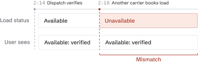
A verified load can become unavailable minutes later without us knowing.
"Man, the loads you sent me [are] already gone..."
"You guys are super slow lol"
Shipped
TruckSmarter offers a centralized platform that helps truck drivers grow their businesses. Small carriers are the fastest-growing segment of the $940B freight industry, but finding jobs is time-consuming and expensive: drivers either spend hours a day piecing together loads across dozens of broker apps, or pay a dispatcher 3–5% of every load to do it for them.
I identified the need for and drove the redesign of Dispatch, an AI assistant that helps owner-operators find jobs faster. This tripled weekly active users and eliminated the need for our ops team to provide white-glove support to users.
User workflows are messy and send truckers in loops. Dispatch v1 helped truckers with the search step, but left them with the rest of the messy process.
A load Dispatch verifies as available can become unavailable minutes later. As a result, users often get stale information.
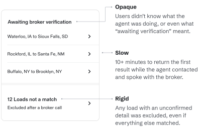
Dispatch ran 10+ minutes with little visible progress, so users often became impatient and left before seeing any value.
Weekly users3.1×
More users validated demand for the reworked product and gave us more insights, leading to faster feedback loops.
ACTIONS PER SESSION1.8×
Users were trusting it with taking real actions, a first step towards it becoming a part of their workflow.
Self-serve0→100%
Freed up ~15 hours of our ops team’s time per week that used to be spent calling users and handling support requests.
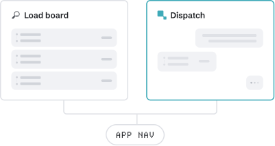
Rather than disrupting our free load board, we chose to first prove Dispatch v2’s value as a distinct experience. Our tight deadline also made changing existing code riskier and costlier.

We chose an approach that keeps users in the driver’s seat. Rather than Dispatch fully booking the load, it loops the user in when it’s time to finalize the booking. This choice also let us reuse significant calling technology we had already built.
In previous sprints for Dispatch v1, user feedback revolved around wanting more loads. I found this strange, since our free load board drew thousands of active users despite sharing the same load ecosystem as Dispatch. To further examine this hypothesis, I devised a study, queried relevant users, and talked to dozens of users.

A verified load can become unavailable minutes later without us knowing.
"Man, the loads you sent me [are] already gone..."
"You guys are super slow lol"
Dispatch offered little users couldn’t already get from the load board.
"What's verification?"
"What is it even doing?"
Dispatch offered little users couldn’t already get from the load board.
"I still need to call them myself, so why pay..."
"Need to figure out how to use it properly..."
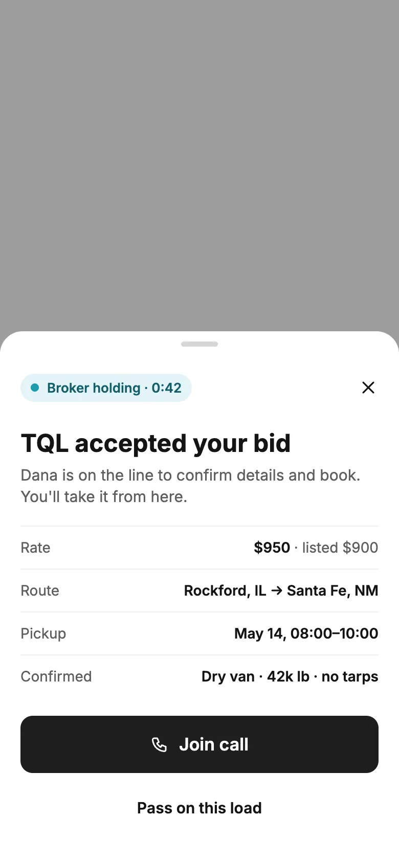
Leadership set a 40-day window to ship to capitalize on the summer freight wave. This kicked off an intense period of rapid prototyping, feedback, and iterations. During weekly design feedback meetings, I presented my designs, iterated on feedback, and worked closely with engineers to ship within the timeline.
We ultimately decided to keep Dispatch v2 as its own distinct product surface, primarily to not disrupt the load board as our acquisition engine.

Keeps core experience unchanged, making development and adoption faster.
Visible context simplifies entity resolution.
Any friction here impacts our top of funnel.
Positions Dispatch as an add-on, rather than a premium, stand-alone experience.
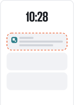
Users already get text updates by from human dispatchers, so this feels natural.
Reaches users even when they’re not in-app.
Our users get dozens of texts every day.
Even with RCS, dense load information and other complex tasks are more difficult without rich UI.

Load board changes have historically frustrated users; a separate surface lets us build without disrupting them.
We won’t need to untangle years of legacy code.
Load board is for scrolling; Dispatch is for insights & actions.
Low-tech audience may never convert.
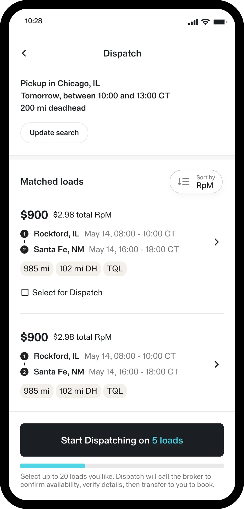
Load cards need to communicate a lot of information for drivers to accurately making judgement calls, so cutting information was out of the question. Considerations while designing: reducing height of card as much as possible to fit enough results, ensuring clear visual hierarchy for quick scanning, keeping designs breathable.

Number as primary ID
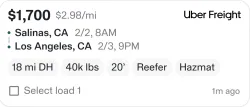
Labeled checkbox + number
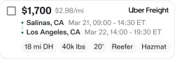
Checkbox top left
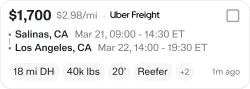
Checkbox top right
Some design decisions: not allowing users to cancel a task so that they could go back.Didn’t want important actions to get buried within multiple different chat threads.
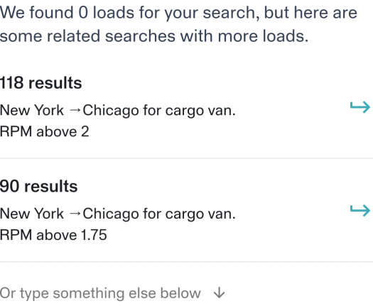
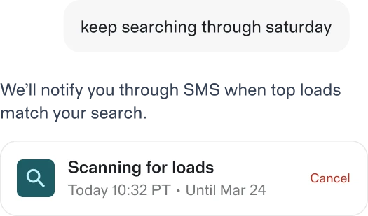
While the agent still needed refinement, we had a much stronger foundation to build from. I monitored conversation data to identify UX issues, prioritize improvements, and close the loop between user feedback and product iterations. I also contributed directly to the codebase, writing agent instructions, polishing the UI, and fixing bugs in production!
The redesign transformed Dispatch from a tool that simply verified loads into an assistant users could independently engage with throughout their workflow.