Shipped
Bridging disjointed product ecosystem to double retention
TruckSmarter is a B2B SaaS company offering a one-stop platform to truck drivers to helps them grow their business.
I proposed and led the design of Jumpstart, a new entry point connecting our free load board to Dispatch, our AI-powered assistant. By introducing higher-value features at the moment of intent, Jumpstart helped drive greater product adoption and 2× retention.
- Timeframe
- 1 month
- Role
- Lead Product Designer
- Team
- 1 PM,
1 engineer - Tools
- Figma, Claude Code,
Mode, Jitter
Problem
Most users never reached Dispatch's highest-value features.
While Dispatch’s highest-value features were downstream from the load search process, most users never reached them, in part due to lack of discoverability.

Users who discovered those features retained better.
Dispatch delivered more value when users discovered certain features.
The load board and Dispatch felt like two separate products.
Despite existing within the same ecosystem, the two tabs had little integration.
Solution
Outcomes
Weekly active users15×
Increased usage of TruckSmarter’s paid feature.
Verification+10percentage pts
Incentivized users to verify their identity, unlocking greater value across the whole app.
Retention2×
Jumpstart led users to discover high value but previously unknown features.
Design decisions
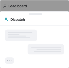
Using a bottom sheet to display Dispatch without feeling disruptive.
Lets users explore Dispatch without fully pulling them out of the load board.
This created a lightweight transition between the two experiences without making users feel like they had left their primary workflow.
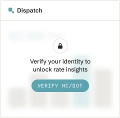
Integrating verification flows.
Rather than letting verification become a surprise blocker, I surfaced access requirements upfront and routed users directly into the verification flow.
By removing unnecessary steps between users and the features they wanted to access, verification rates improved and gave users access to higher-value capabilities across the rest of the app.
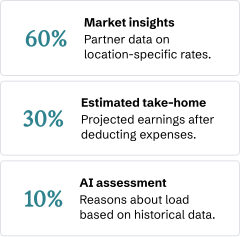
Creating a consistent entry that adapts to every load.
Jumpstart needed to be a reliable path into Dispatch, not a feature users encountered only on random loads.
Because the available data varied by load and truck type, I designed three variants to surface the most relevant insights for each situation.
Process
Research revealed a gap between Dispatch's value and what users were actually discovering.
“I need more time to play with Dispatch”
“I mean what was the difference between the loadboard and Dispatch….”
“I wanted Dispatch to bid on loads I found on the load board”
I proposed Jumpstart: an opportunity to introduce Dispatch the moment it was most relevant; after a user has already found a potential load through our load board.
Research showed that users preferred finding potential loads through our load board, but valued Dispatch’s ability to help act on them. Rather than changing that behavior, I proposed Jumpstart as a natural next step: introducing Dispatch’s capabilities when users found a load worth exploring.
We aligned on the idea as a way to increase adoption of Dispatch and create a more cohesive user experience. With our original 40-day shipping window behind us, we had more flexibility to explore a contextual connection without disrupting the core experience.
Once aligned, the key question became which of Dispatch's capabilities Jumpstart should introduce.
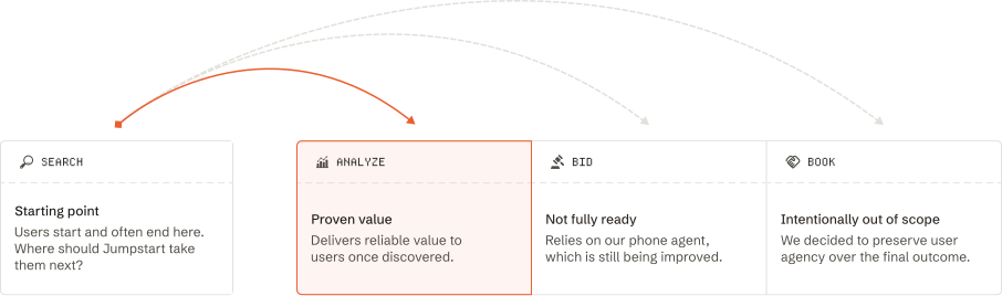
We considered two directions: introducing Dispatch’s analytical capabilities, which helped users evaluate loads, or its actioning capabilities, which could call brokers to negotiate and bid on their behalf.
While actioning offered a more differentiated experience, our phone operations were still being improved and weren’t yet reliable enough to make them the centerpiece of Jumpstart. Our analytical capabilities, on the other hand, were more mature and could deliver value immediately, even if users could arrive at similar insights through more manual effort.
We decided to lead users toward analysis first, creating a reliable introduction to Dispatch while leaving room to expand into more advanced actions as those capabilities matured.
Our users had a variety of different attributes, so one Jumpstart variant wouldn’t cover it all: so we aligned on 3 separate variants to start off with to ensure everyone could get a helpful jumpstart.
I explored interaction models that could introduce Jumpstart without disrupting the underlying search experience.

- Reduced scope + familiar UI
Keeps core search and load viewing experience unchanged, making development and adoption faster.
- Easier entity resolution
Visible context simplifies entity resolution.
- Disruptive to main user acquisition channel
Any friction we add here impacts our top of funnel.
- Undersells our AI bet
Positions Dispatch as an add-on, rather than a premium, stand-alone experience.

- Reduced scope + familiar UI
Keeps core search and load viewing experience unchanged, making development and adoption faster.
- Easier entity resolution
Visible context simplifies entity resolution.
- Disruptive to main user acquisition channel
Any friction we add here impacts our top of funnel.
- Undersells our AI bet
Positions Dispatch as an add-on, rather than a premium, stand-alone experience.
A new question was raised: would opening Jumpstart mean new users accepted Dispatch's legal terms?
We decided it shouldn’t. Users needed to consciously review and accept the terms before initiating a conversation, but we still needed a way to pass the selected load’s context into Dispatch. Engineering solved this by seeding the conversation with a system-generated message.
Users were notified of the terms of use, and continuing the interaction constituted agreement.
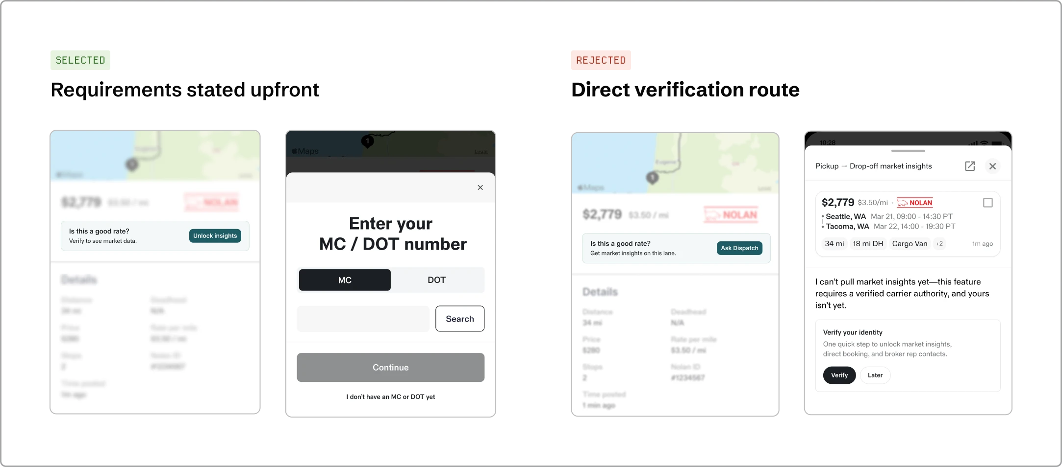
We also debated how to gate access. I advocated for making MC/DOT verification requirements clear upfront.
The team initially favored sending users straight into the chat, letting Dispatch explain the verification requirement and surface the CTA.
I pushed back, advocating for surfacing clear requirements upfront, and a CTA that took users directly into the verification flow. This avoided making verification an unexpected blocker after users had already discovered a feature they wanted to use.
Completing verification also unlocked higher-value capabilities across the rest of the app, making it a worthwhile step beyond Dispatch alone.
We made a scope tradeoff to get Jumpstart into users' hands sooner, which helped us learn how to better shape the continued experience.
To avoid delaying the feature, we decided to simplify the initial scope and defer part of the experience to a later iteration.
The resulting rollout gave us an opportunity to observe how different entry points shaped user engagement. One version made it more intuitive to continue the conversation, while the other left that next step less apparent. This highlighted how important it was to make the path from exploring a load to engaging with Dispatch feel clear.
Ultimately, Jumpstart connected load discovery with Dispatch's higher-value capabilities, creating a more cohesive product experience as well as stronger user engagement and retention.
One particularly exciting result was that 12% of those that had completed verification had been on the platform for over 2 years, validating the need for a more connected experience.